
The Twilight Saga: Breaking Dawn - Part 1 font
Fourth film, directed by Bill Condon for Summit Entertainment.
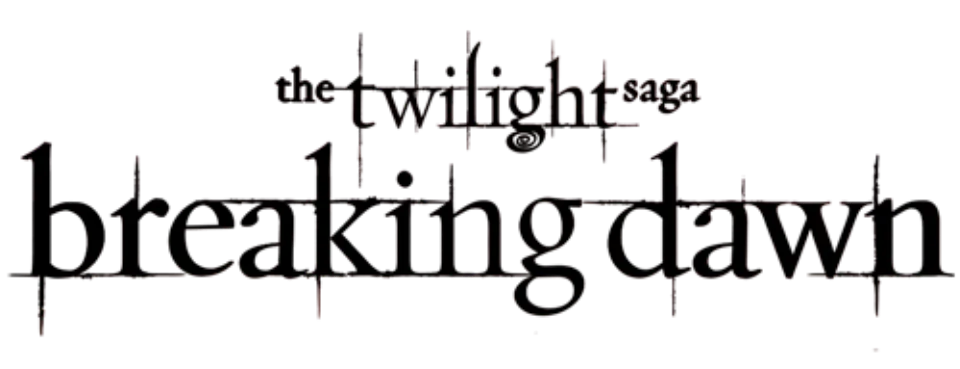
- breaking dawn logo: Custom lettering (our visual match)
Try the free alternatives
Type anything to see it in each free font. Select a font's name to test it further and download it.
-
The Twilight Saga: Breaking Dawn - Part 1
-
The Twilight Saga: Breaking Dawn - Part 1
-
The Twilight Saga: Breaking Dawn - Part 1
-
The Twilight Saga: Breaking Dawn - Part 1
breaking dawn logo
| What it is | Custom lettering drawn for this title, not a font you can install |
|---|---|
| Licence | Proprietary: owned by the rights holder and not offered for licensing. |
Our visual match Our own judgement after comparing the lettering side by side.
Two DaFont threads show this logo. In one, a member gives the fan font Twilight New Moon for the word twilight and says the base of breaking dawn is very similar to Garamond, offering a retail font called Twylight as well. In the other, the person asking rules out Zephyr, the books' face, and is offered LD Twylight as merely similar. Nobody names an exact typeface, and we found no statement from Summit. By our own comparison the title continues the spiked, Garamond-like lettering of the first film's logo, so we record it as custom lettering.
Sources: The Twilight Saga: Breaking Dawn (DaFont forum), The Twilight Saga font? Please help? (DaFont forum), LD Twylight (MyFonts)
Fan-made replicas
Fonts made by fans to recreate this lettering. They are not official, and each author sets their own terms.
- Twilight New Moon by Alphabet & Type. Free.
Sources: Twilight New Moon by Alphabet & Type (DaFont), Twilight Movie Font (DaFont forum)
Free alternatives
-
EB Garamond Similar
A Garamond revival with the same small x-height, slanted stress and long ascenders as the film lettering. It has none of the thin spikes or the spiral under the g.
Compared by eye against the original.
-
Cormorant Garamond, weight 600 Similar
At weight 600 it gives the same old-style letter shapes with sharp serifs and a two-storey g. Its hairlines are thinner and its ascenders taller.
Compared by eye against the original.
-
IM Fell English Same mood
An old-style face digitised from worn printed type, so its rough edges echo the scratched finish of the logo. Its letters are heavier and less regular.
Compared by eye against the original.
-
Sorts Mill Goudy Same mood
A soft old-style book face with a gentle, literary feel. Its serifs are rounder and its letters wider than the logo's.
Compared by eye against the original.
What the labels mean
- Our visual match: Our own judgement after comparing the lettering side by side.
- Similar: The same style, with differences you can see.
- Same mood: Gives the same feel without being a look-alike.
What we link to
We link only to owners (the rights holder, the foundry or its official reseller) and to designers' own pages, and we host a fan-made font only with its designer's permission. Every free alternative is published under an open licence and downloads from its page on this site.
More from Twilight
The Twilight Saga: Breaking Dawn - Part 1 and Twilight are trademarks of Summit Entertainment. Simple But How is not affiliated with or endorsed by Summit Entertainment.