
Resident Evil fonts
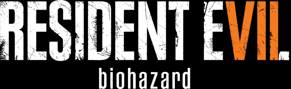
Capcom has never named the faces in its Resident Evil logos, but people who identify fonts have traced each era to a retail typeface. The red, shadowed logo of the 1996 original and its early sequels is set in a very tight Compacta Bold; Resident Evil 6 used a serif wordmark instead; and since Resident Evil 7 in 2017 the series has used Paul Renner's Plak Black Extra Condensed with a scratched texture, paired with a second face for the subtitle line. The Japanese releases carry the name Biohazard, which the 2017 logo also shows in Rama Gothic Rounded. The 2002 film used its own flared wordmark based on Idiosynoptium.
Games
- Resident Evil Requiem (2026) RESIDENT EVIL wordmark in the logo: Modified Plak Black Extra Condensed
- Resident Evil 2 (2019) RESIDENT EVIL 2 logo: Modified Plak Black Extra Condensed
- Resident Evil 7: Biohazard (2017) RESIDENT EVIL wordmark in the logo: Modified Plak Black Extra Condensed
- Resident Evil (1996) RESIDENT EVIL logo: Compacta Bold
Films
Resident Evil is a trademark of Capcom. Simple But How is not affiliated with or endorsed by Capcom.