
Resident Evil Requiem fonts
Ninth main game in the series, developed and published by Capcom.
- Game
- 2026
- Resident Evil
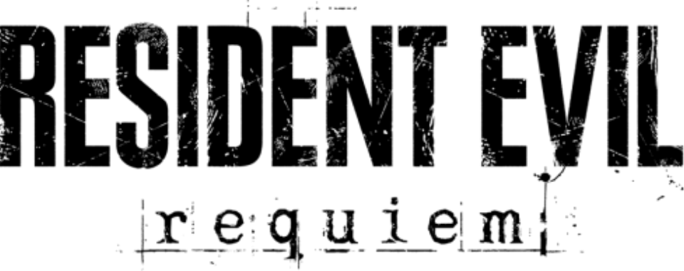
- RESIDENT EVIL wordmark in the logo: Modified Plak Black Extra Condensed (community identification)
- requiem line in the logo: Not identified
- Menus and on-screen text: Neue Frutiger (community identification)
- Subtitles: Rodin (community identification)
Try the free alternatives
Type anything to see it in each free font suggested for the lettering you pick. Select a font's name to test it further and download it.
-
Resident Evil Requiem
-
Resident Evil Requiem
-
Resident Evil Requiem
RESIDENT EVIL wordmark in the logo
| What it is | A typeface that was altered for this title |
|---|---|
| Typeface | Plak Black Extra Condensed |
| Designer | Paul Renner |
| Foundry | Linotype (first issued by D. Stempel AG) |
| Licence | Commercial: sold by the foundry, and most uses need a paid licence. |
Community identification Agreed by people who identify fonts, with no official word.
The Fonts In Use entry for the game identifies the wordmark as Plak Extra Condensed with the scratched finish first seen on Resident Evil 7, and notes a main-menu version with ink slashed across the subtitle. By our comparison with the MyFonts type tester the letters match the heaviest extra-condensed style. Capcom has not named the face.
Sources: Resident Evil: Requiem video game (Fonts In Use), Plak by Linotype (MyFonts)
License Plak Black Extra Condensed from Linotype (first issued by D. Stempel AG)
Free alternatives
-
League Gothic Similar
Tall, very narrow, flat-sided capitals with the same compressed rhythm. It is a little lighter than the logo and its R leg is angled rather than straight.
Compared by eye against the original.
-
Antonio, weight 700 Similar
At weight 700 it is a condensed grotesque with Plak's tall proportions and squared curves. It is slightly lighter and its S is more open.
Compared by eye against the original.
-
Big Shoulders Display, weight 800 Similar
At weight 800 it has the same narrow, upright, flat-sided capitals and dense colour. Its corners are sharper and squarer than Plak's.
Compared by eye against the original.
requiem line in the logo
This font has not been identified. The Fonts In Use entry for the game lists the widely spaced lowercase requiem line as an unidentified typewriter-style face. We found no DaFont thread or other source that names it.
Free alternatives
-
Special Elite Similar
A worn typewriter face with rough, inky edges and slab serifs, close to the distressed line. Its letters are heavier and less widely spaced.
Compared by eye against the original.
-
Courier Prime Similar
A clean monospaced typewriter design with the same even slab serifs and fixed widths. It has none of the logo's wear.
Compared by eye against the original.
-
Cutive Mono Same mood
A light, open typewriter face that suits the widely tracked line. Its strokes are thinner and more delicate than the logo's.
Compared by eye against the original.
Menus and on-screen text
| What it is | A retail typeface |
|---|---|
| Typeface | Neue Frutiger |
| Designer | Adrian Frutiger and Akira Kobayashi |
| Foundry | Linotype |
| Licence | Commercial: sold by the foundry, and most uses need a paid licence. |
Community identification Agreed by people who identify fonts, with no official word.
The Fonts In Use entry for the game names Neue Frutiger Roman as the main interface and body face, alongside Kairos Sans, ITC American Typewriter in the main and save menus, and Univers for counters and button prompts.
Sources: Resident Evil: Requiem video game (Fonts In Use), Neue Frutiger in use (Fonts In Use)
License Neue Frutiger from Linotype
Free alternatives
-
Hind Similar
A humanist sans with open apertures and upright, even strokes in the Frutiger manner. Its letters are slightly narrower and its g is single-storey like Frutiger's.
Compared by eye against the original.
-
Assistant Similar
A humanist sans with clear, open forms suited to screen text. It is lighter and a little more compact than Neue Frutiger.
Compared by eye against the original.
-
Istok Web Similar
Open humanist letters with a calm texture close to Frutiger's. Its spacing is wider and some curves are flatter.
Compared by eye against the original.
Subtitles
| What it is | A retail typeface |
|---|---|
| Typeface | Rodin |
| Foundry | Fontworks |
| Licence | Commercial: sold by the foundry, and most uses need a paid licence. |
Community identification Agreed by people who identify fonts, with no official word.
The Fonts In Use entry for the game names Fontworks' Rodin for the subtitles, as on Resident Evil 7. Capcom has not said so itself.
Sources: Resident Evil: Requiem video game (Fonts In Use), Rodin (Fontworks) in use (Fonts In Use)
Free alternatives
-
Noto Sans JP Similar
A Japanese gothic family whose Latin letters have the same plain, even strokes and generous width as Rodin's. Its capitals are slightly narrower.
Compared by eye against the original.
-
M PLUS 1p Similar
Another Japanese gothic with a matching clean Latin set, built for screens. It is lighter at the regular weight and more open in spacing.
Compared by eye against the original.
-
BIZ UDPGothic Similar
A proportional Japanese gothic designed for legibility, with large, open Latin letters like Rodin's. Its x-height is taller.
Compared by eye against the original.
What the labels mean
- Community identification: Agreed by people who identify fonts, with no official word.
- Similar: The same style, with differences you can see.
- Same mood: Gives the same feel without being a look-alike.
What we link to
We link only to owners (the rights holder, the foundry or its official reseller) and to designers' own pages, and we host a fan-made font only with its designer's permission. Every free alternative is published under an open licence and downloads from its page on this site.
More from Resident Evil
- Resident Evil 2 (2019, game) RESIDENT EVIL 2 logo: Modified Plak Black Extra Condensed
- Resident Evil 7: Biohazard (2017, game) RESIDENT EVIL wordmark in the logo: Modified Plak Black Extra Condensed
- Resident Evil (2002, film) RESIDENT EVIL wordmark on the poster: Modified Idiosynoptium
- Resident Evil (1996, game) RESIDENT EVIL logo: Compacta Bold
Resident Evil Requiem and Resident Evil are trademarks of Capcom. Simple But How is not affiliated with or endorsed by Capcom.