
Resident Evil 7: Biohazard fonts
First-person survival horror game developed and published by Capcom; it introduced the logo style the series still uses.
- Game
- 2017
- Resident Evil
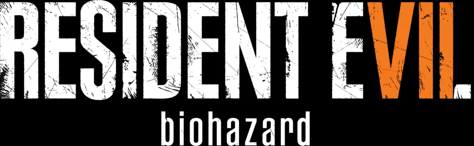
- RESIDENT EVIL wordmark in the logo: Modified Plak Black Extra Condensed (community identification)
- biohazard line in the logo: Rama Gothic Rounded (community identification)
- Menus and on-screen text: Franklin Gothic (community identification)
- Subtitles: Rodin (community identification)
Try the free alternatives
Type anything to see it in each free font suggested for the lettering you pick. Select a font's name to test it further and download it.
-
Resident Evil 7: Biohazard
-
Resident Evil 7: Biohazard
-
Resident Evil 7: Biohazard
-
Resident Evil 7: Biohazard
RESIDENT EVIL wordmark in the logo
| What it is | A typeface that was altered for this title |
|---|---|
| Typeface | Plak Black Extra Condensed |
| Designer | Paul Renner |
| Foundry | Linotype (first issued by D. Stempel AG) |
| Licence | Commercial: sold by the foundry, and most uses need a paid licence. |
Community identification Agreed by people who identify fonts, with no official word.
The Fonts In Use entry for the game identifies the series wordmark as Plak Extra Condensed, replacing the Compacta of the earlier games, with the letters given a scratched texture and the VII picked out in orange. We set the title in Plak Black Extra Condensed in the MyFonts type tester and the narrow R with its straight leg, the S and the E agree with the logo. Capcom has not confirmed it.
Sources: Resident Evil 7: Biohazard video game (Fonts In Use), Plak Condensed & Extra Condensed in use (Fonts In Use), Plak by Linotype (MyFonts)
License Plak Black Extra Condensed from Linotype (first issued by D. Stempel AG)
Free alternatives
-
League Gothic Similar
Tall, very narrow, flat-sided capitals with the same compressed rhythm. It is a little lighter than the logo and its R leg is angled rather than straight.
Compared by eye against the original.
-
Antonio, weight 700 Similar
At weight 700 it is a condensed grotesque with Plak's tall proportions and squared curves. It is slightly lighter and its S is more open.
Compared by eye against the original.
-
Big Shoulders Display, weight 800 Similar
At weight 800 it has the same narrow, upright, flat-sided capitals and dense colour. Its corners are sharper and squarer than Plak's.
Compared by eye against the original.
-
Bebas Neue Similar
Clean condensed capitals with a similar height and flat sides. It is wider and lighter than the logo, so the word reads less compressed.
Compared by eye against the original.
biohazard line in the logo
| What it is | A retail typeface |
|---|---|
| Typeface | Rama Gothic Rounded |
| Designer | Ryoichi Tsunekawa |
| Foundry | Dharma Type |
| Licence | Commercial: sold by the foundry, and most uses need a paid licence. |
Community identification Agreed by people who identify fonts, with no official word.
The Fonts In Use entry for the game names Rama Gothic Rounded for the lowercase biohazard line under the wordmark, the series' Japanese title shown in the Western logo. Dharma Type's page describes the face as a condensed sans with rounded corners, which fits the line; we did not test it in a type tester. Capcom has not named it.
Sources: Resident Evil 7: Biohazard video game (Fonts In Use), Rama Gothic Rounded in use (Fonts In Use), Rama Gothic Rounded (Dharma Type)
License Rama Gothic Rounded from Dharma Type
Free alternatives
-
Smooch Sans, weight 500 Similar
At weight 500 it is a narrow, squarish sans with softened corners, close to the line's compact lowercase. Its a and z are more geometric.
Compared by eye against the original.
-
Yanone Kaffeesatz, weight 500 Similar
At weight 500 it has the condensed proportions and slightly rounded stroke ends of the line. It is a touch heavier and less even in width.
Compared by eye against the original.
-
Pathway Gothic One Similar
A narrow gothic lowercase with the same tall x-height and tight fit. Its stroke ends are cut square rather than rounded.
Compared by eye against the original.
-
Dosis, weight 600 Same mood
At weight 600 it shares the rounded stroke ends, giving a similar soft finish. It is clearly wider than the condensed line.
Compared by eye against the original.
Menus and on-screen text
| What it is | A retail typeface |
|---|---|
| Typeface | Franklin Gothic |
| Designer | Morris Fuller Benton |
| Foundry | American Type Founders |
| Licence | Commercial: sold by the foundry, and most uses need a paid licence. |
Community identification Agreed by people who identify fonts, with no official word.
The Fonts In Use entry for the game names Franklin Gothic in its Book weight as the main interface face, with Futura used now and then for headings and a digital-clock face for counters. It does not say which digital version the game uses, so no seller is linked.
Sources: Resident Evil 7: Biohazard video game (Fonts In Use), Franklin Gothic in use (Fonts In Use)
Free alternatives
-
Libre Franklin Close match
An open reinterpretation of Franklin Gothic with the same double-storey g, narrow capitals and slightly squared curves. Its spacing is a little more open.
Compared by eye against the original.
-
Public Sans Similar
Built from Libre Franklin, so it keeps the American gothic structure. It is more neutral and even, with less character in the g and a.
Compared by eye against the original.
-
Archivo Similar
A grotesque with Franklin-like proportions and sturdy strokes. Its letters are slightly wider and its terminals cut flatter.
Compared by eye against the original.
Subtitles
| What it is | A retail typeface |
|---|---|
| Typeface | Rodin |
| Foundry | Fontworks |
| Licence | Commercial: sold by the foundry, and most uses need a paid licence. |
Community identification Agreed by people who identify fonts, with no official word.
The Fonts In Use entry for the game says the subtitles are set only in Fontworks' Rodin, a Japanese gothic family, and suggests this may be for localisation. Capcom has not said so itself.
Sources: Resident Evil 7: Biohazard video game (Fonts In Use), Rodin (Fontworks) in use (Fonts In Use)
Free alternatives
-
Noto Sans JP Similar
A Japanese gothic family whose Latin letters have the same plain, even strokes and generous width as Rodin's. Its capitals are slightly narrower.
Compared by eye against the original.
-
M PLUS 1p Similar
Another Japanese gothic with a matching clean Latin set, built for screens. It is lighter at the regular weight and more open in spacing.
Compared by eye against the original.
-
BIZ UDPGothic Similar
A proportional Japanese gothic designed for legibility, with large, open Latin letters like Rodin's. Its x-height is taller.
Compared by eye against the original.
What the labels mean
- Community identification: Agreed by people who identify fonts, with no official word.
- Close match: Most people would take it for the same font at a glance.
- Similar: The same style, with differences you can see.
- Same mood: Gives the same feel without being a look-alike.
What we link to
We link only to owners (the rights holder, the foundry or its official reseller) and to designers' own pages, and we host a fan-made font only with its designer's permission. Every free alternative is published under an open licence and downloads from its page on this site.
More from Resident Evil
- Resident Evil Requiem (2026, game) RESIDENT EVIL wordmark in the logo: Modified Plak Black Extra Condensed
- Resident Evil 2 (2019, game) RESIDENT EVIL 2 logo: Modified Plak Black Extra Condensed
- Resident Evil (2002, film) RESIDENT EVIL wordmark on the poster: Modified Idiosynoptium
- Resident Evil (1996, game) RESIDENT EVIL logo: Compacta Bold
Resident Evil 7: Biohazard and Resident Evil are trademarks of Capcom. Simple But How is not affiliated with or endorsed by Capcom.