
Sonic Adventure fonts
Dreamcast game developed by Sonic Team and published by Sega; its logo carries the redrawn SONIC wordmark that later games kept.
- Game
- 1998
- Sonic the Hedgehog
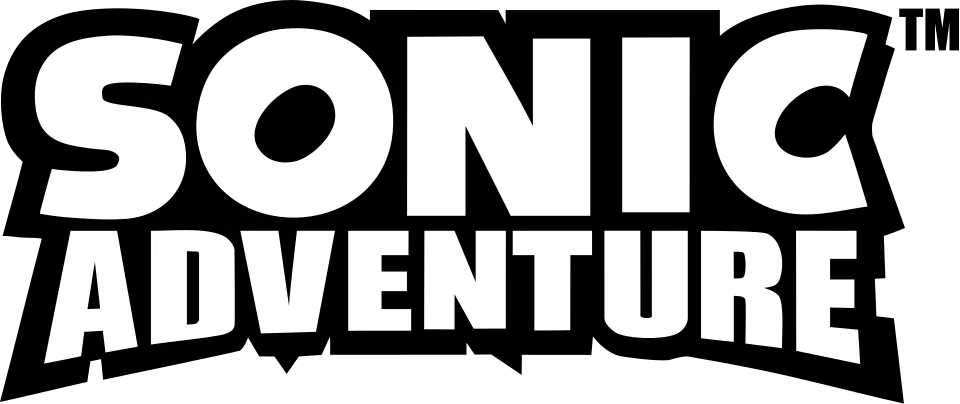
- SONIC wordmark in the logo: Modified Syntax Ultra Black (community identification)
- ADVENTURE line in the logo: Modified Impact (our visual match)
Try the free alternatives
Type anything to see it in each free font suggested for the lettering you pick. Select a font's name to test it further and download it.
-
Sonic Adventure
-
Sonic Adventure
-
Sonic Adventure
-
Sonic Adventure
SONIC wordmark in the logo
| What it is | A typeface that was altered for this title |
|---|---|
| Typeface | Syntax Ultra Black |
| Designer | Hans Eduard Meier |
| Foundry | Linotype (first issued by D. Stempel AG) |
| Licence | Commercial: sold by the foundry, and most uses need a paid licence. |
Community identification Agreed by people who identify fonts, with no official word.
A DaFont forum reply describes the modern wordmark as custom lettering built on Syntax Ultra Black, with the O rotated and reused to make the C; a thread on this logo answers with the fan replica of the same lettering. Compared with the foundry specimen, the S, N and I follow Syntax but are heavier, and the O's counter is strongly tilted. Sega has not confirmed any of this.
Sources: Sonic Next-Gen ~ "The Hedgehog" Font (DaFont forum), What is the font of this Sonic logo (DaFont forum), Syntax by Linotype (MyFonts)
License Syntax Ultra Black from Linotype (first issued by D. Stempel AG)
Fan-made replicas
Fonts made by fans to recreate this lettering. They are not official, and each author sets their own terms.
- NiseSegaSonic by ACT SELECT (SegaSonic fan site). Personal use only.
Sources: [SEGA SONIC] Replica Font 3.0 (ACT SELECT), What is the font of this Sonic logo (DaFont forum)
"Personal use only" rules out commercial work: anything you sell, client projects, merchandise and monetised videos. Treat a replica with no stated licence the same way.
Free alternatives
-
Rammetto One Similar
Closest to the redrawn wordmark's weight, and its O has the same kind of small slanted oval counter. The S and C are more irregular and the N's corners are pointed, so the overall look is more cartoonish.
Compared by eye against the original.
-
Paytone One Similar
Clean heavy letters with diagonally cut ends on S and C, like the wordmark. It is lighter, with more open counters, and its O has an upright counter.
Compared by eye against the original.
-
Peace Sans Similar
Has the near-solid weight and tiny counters of the wordmark and angled S terminals. Its O is a plain circle and its C ends in wedge cuts, which makes it more geometric.
Compared by eye against the original.
-
Fira Sans, weight 900 Similar
At weight 900 it has the humanist structure and slanted S and C endings that the wordmark inherits from Syntax. It is clearly narrower and lighter.
Compared by eye against the original.
ADVENTURE line in the logo
| What it is | A typeface that was altered for this title |
|---|---|
| Typeface | Impact |
| Designer | Geoffrey Lee |
| Foundry | Monotype |
| Licence | Commercial: sold by the foundry, and most uses need a paid licence. |
Our visual match Our own judgement after comparing the lettering side by side.
The only published identification is one DaFont forum reply, posted as a suggestion and not marked as identified, that names Impact for the word ADVENTURE in this logo. The label rests on our own comparison: set in Impact beside the logo from Wikimedia Commons, the word has the same letter structure and the same slit-like counters in A, D and R, while the logo version is about a third wider and its lower edge is cut to follow the outline.
Sources: What is the font of this Sonic logo (DaFont forum), Impact by Monotype (MyFonts)
Free alternatives
-
Anton Similar
The same heavy condensed grotesque style with flat-sided round letters and tight spacing. Anton is narrower and taller in proportion than Impact, and its counters are a little more open.
Compared by eye against the original.
-
Sofia Sans Extra Condensed, weight 900 Similar
At weight 900 it has Impact's dense, even colour and straight-legged R. Its curves are rounder and its letters slightly wider apart.
Compared by eye against the original.
-
Alumni Sans, weight 900 Similar
At weight 900 it is a compact, flat-sided condensed sans with small counters like Impact. It is squarer in the curves and a little lighter.
Compared by eye against the original.
-
League Gothic Same mood
A tall condensed headline gothic with the same poster feel. It is much narrower and lighter than Impact, so it does not pass for it.
Compared by eye against the original.
What the labels mean
- Community identification: Agreed by people who identify fonts, with no official word.
- Our visual match: Our own judgement after comparing the lettering side by side.
- Similar: The same style, with differences you can see.
- Same mood: Gives the same feel without being a look-alike.
What we link to
We link only to owners (the rights holder, the foundry or its official reseller) and to designers' own pages, and we host a fan-made font only with its designer's permission. Every free alternative is published under an open licence and downloads from its page on this site.
More from Sonic the Hedgehog
- Sonic the Hedgehog 2 (2022, film) SONIC wordmark in the logo: Modified Integral CF Heavy Oblique
- Sonic the Hedgehog (2020, film) SONIC wordmark in the logo: Modified Integral CF Heavy Oblique
- Sonic X (2003, TV show) SONIC wordmark in the logo: Modified Syntax Ultra Black
- Sonic the Hedgehog 2 (1992, game) SONIC wordmark in the logo: Modified Syntax Ultra Black
- Sonic the Hedgehog (1991, game) SONIC wordmark in the logo: Modified Syntax Ultra Black
Sonic Adventure and Sonic the Hedgehog are trademarks of Sega. Simple But How is not affiliated with or endorsed by Sega.