
Sonic the Hedgehog (2020) fonts
Live-action and computer-animated film from Paramount Pictures and Sega Sammy, directed by Jeff Fowler.
- Film
- 2020
- Sonic the Hedgehog
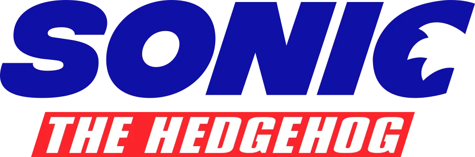
- SONIC wordmark in the logo: Modified Integral CF Heavy Oblique (our visual match)
- THE HEDGEHOG line in the logo: Modified Compacta Italic (community identification)
Try the free alternatives
Type anything to see it in each free font suggested for the lettering you pick. Select a font's name to test it further and download it.
-
Sonic the Hedgehog
-
Sonic the Hedgehog
-
Sonic the Hedgehog
-
Sonic the Hedgehog
SONIC wordmark in the logo
| What it is | A typeface that was altered for this title |
|---|---|
| Typeface | Integral CF Heavy Oblique |
| Foundry | Connary Fagen |
| Licence | Commercial: sold by the foundry, and most uses need a paid licence. |
Our visual match Our own judgement after comparing the lettering side by side.
Neither Paramount nor Sega has named a font. The DaFont thread on this logo ends without agreement: Essay, Latina Essential and Futura Extra Black Italic are each offered once. One reply in a later thread on the sequel's logo, which reuses the wordmark, names Integral CF Heavy Oblique and cites a fan wiki, so the forum does not settle it. The label is our own comparison with the foundry's specimen and type tester: the wide S with level cuts, the oval O, the N and the I line up in width, weight and slant, while the C has been redrawn with quill-like spikes.
Sources: Sonic The Hedgehog Movie Logo Fonts? (DaFont forum), Sonic 2 Movie Font (DaFont forum), Integral CF (Connary Fagen)
License Integral CF Heavy Oblique from Connary Fagen
Free alternatives
-
Zalando Sans Expanded, weight 900, italic Similar
At weight 900 italic it is a wide, slanted sans with level-cut S and C terminals and an oval O, like the film wordmark. It is lighter than the logo, with larger counters, and it leans less steeply.
Compared by eye against the original.
-
Dela Gothic One Similar
Very wide and very heavy, with flat horizontal terminals on S and C that echo the wordmark. It has no slanted style and its C is boxier.
Compared by eye against the original.
-
Unbounded, weight 900 Similar
At weight 900 it has the same extended width and horizontal stroke endings. Its round letters are squared-off superellipses rather than ovals, and there is no italic.
Compared by eye against the original.
-
Montserrat, weight 900, italic Same mood
At weight 900 italic it gives a bold, slanted geometric word. It is noticeably narrower than the wordmark, and its S and C end in angled rather than level cuts.
Compared by eye against the original.
THE HEDGEHOG line in the logo
| What it is | A typeface that was altered for this title |
|---|---|
| Typeface | Compacta Italic |
| Designer | Fred Lambert |
| Foundry | Letraset (digital versions from ITC) |
| Licence | Commercial: sold by the foundry, and most uses need a paid licence. |
Community identification Agreed by people who identify fonts, with no official word.
In one DaFont thread the person asking answers his own question, Compacta Italic with extra skew matched on the D and G, and nobody replies to confirm it; in another a member names British Inserat, which Fonts In Use describes as an apparent copy of Compacta, so two members point at the same design. Impact was also suggested there as merely close. Beside upright Compacta the logo's rounded-rectangle D and O agree, but the line is wider than Compacta's regular width, so the exact style is not settled. No official source names the face.
Sources: Hedgehog font? (DaFont forum), Sonic The Hedgehog Movie Logo Fonts? (DaFont forum), Compacta in use (Fonts In Use), British Inserat in use (Fonts In Use)
License Compacta Italic from Letraset (digital versions from ITC)
Free alternatives
-
Alumni Sans, weight 900, italic Similar
At weight 900 italic its flat-sided, squared-off D, O and G are the nearest to the rounded-rectangle shapes of the line. It is narrower than the line in the logo and leans less steeply.
Compared by eye against the original.
-
Barlow Condensed, weight 900, italic Similar
At weight 900 italic it is a heavy, slanted condensed sans with rounded-rectangle curves and a G with a flat bar. Its corners are softer and its slant gentler than the logo's.
Compared by eye against the original.
-
Sofia Sans Extra Condensed, weight 900, italic Similar
At weight 900 italic it has the same dense condensed colour and a forward slant. Its curves are rounder than the squared forms of the logo line, and it leans less.
Compared by eye against the original.
-
Anton Same mood
A heavy condensed poster face that gives the same punchy second line. It is upright only, narrower, and closer to Impact than to Compacta.
Compared by eye against the original.
What the labels mean
- Community identification: Agreed by people who identify fonts, with no official word.
- Our visual match: Our own judgement after comparing the lettering side by side.
- Similar: The same style, with differences you can see.
- Same mood: Gives the same feel without being a look-alike.
What we link to
We link only to owners (the rights holder, the foundry or its official reseller) and to designers' own pages, and we host a fan-made font only with its designer's permission. Every free alternative is published under an open licence and downloads from its page on this site.
More from Sonic the Hedgehog
- Sonic the Hedgehog 2 (2022, film) SONIC wordmark in the logo: Modified Integral CF Heavy Oblique
- Sonic X (2003, TV show) SONIC wordmark in the logo: Modified Syntax Ultra Black
- Sonic Adventure (1998, game) SONIC wordmark in the logo: Modified Syntax Ultra Black
- Sonic the Hedgehog 2 (1992, game) SONIC wordmark in the logo: Modified Syntax Ultra Black
- Sonic the Hedgehog (1991, game) SONIC wordmark in the logo: Modified Syntax Ultra Black
Sonic the Hedgehog is a trademark of Sega. Simple But How is not affiliated with or endorsed by Sega.