
Sonic the Hedgehog 2 fonts
Mega Drive/Genesis sequel developed by Sega Technical Institute and published by Sega.
- Game
- 1992
- Sonic the Hedgehog
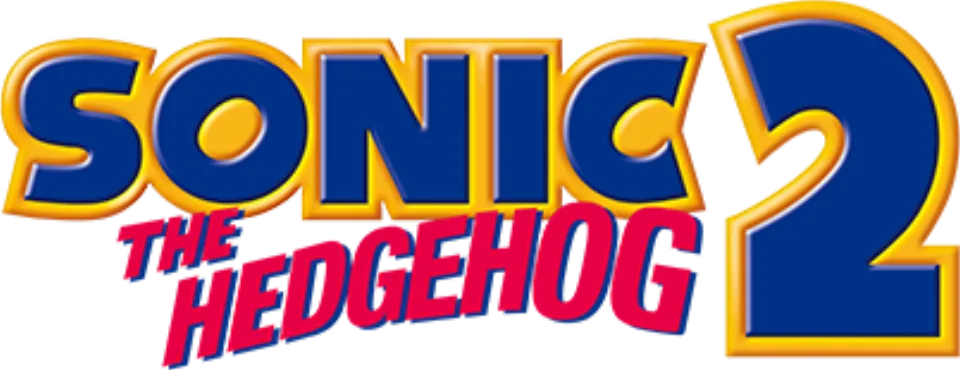
- SONIC wordmark in the logo: Modified Syntax Ultra Black (community identification)
- Zone title cards: Modified Roco (community identification)
Try the free alternatives
Type anything to see it in each free font suggested for the lettering you pick. Select a font's name to test it further and download it.
-
Sonic the Hedgehog 2
-
Sonic the Hedgehog 2
-
Sonic the Hedgehog 2
-
Sonic the Hedgehog 2
SONIC wordmark in the logo
| What it is | A typeface that was altered for this title |
|---|---|
| Typeface | Syntax Ultra Black |
| Designer | Hans Eduard Meier |
| Foundry | Linotype (first issued by D. Stempel AG) |
| Licence | Commercial: sold by the foundry, and most uses need a paid licence. |
Community identification Agreed by people who identify fonts, with no official word.
The logo reuses the 1991 SONIC wordmark, now outlined, beside a large numeral 2 that matches no font we found. DaFont forum replies trace the wordmark to Syntax Ultra Black with a modified O and C, and our comparison with the foundry specimen agrees; Sega has not confirmed it.
Sources: The "SONIC" part font request (DaFont forum), Sonic Font name? (DaFont forum), Syntax by Linotype (MyFonts)
License Syntax Ultra Black from Linotype (first issued by D. Stempel AG)
Fan-made replicas
Fonts made by fans to recreate this lettering. They are not official, and each author sets their own terms.
- NiseSegaSonic by ACT SELECT (SegaSonic fan site). Personal use only.
Sources: [SEGA SONIC] Replica Font 3.0 (ACT SELECT), The "SONIC" part font request (DaFont forum)
"Personal use only" rules out commercial work: anything you sell, client projects, merchandise and monetised videos. Treat a replica with no stated licence the same way.
Free alternatives
-
Paytone One Similar
A single heavy weight with the same diagonally cut ends on S and C and a round O. It is less black than the logo, its counters are more open, and the O's counter sits upright instead of tilted.
Compared by eye against the original.
-
Rammetto One Similar
Matches the logo's weight and is the only candidate whose O has a small slanted oval counter. Its S and C are more irregular and the N has pointed corners, so it reads as more cartoonish.
Compared by eye against the original.
-
Peace Sans Similar
Has the logo's near-solid weight, tiny counters and angled S terminals. The shapes are geometric rather than humanist: the O is a plain circle and the C opens with wedge-shaped cuts.
Compared by eye against the original.
-
Fira Sans, weight 900 Similar
At weight 900 it shows the same humanist structure as Syntax, with slanted ends on S and C. It is narrower and lighter than the logo, and the N's diagonal is thinner.
Compared by eye against the original.
Zone title cards
| What it is | A typeface that was altered for this title |
|---|---|
| Typeface | Roco |
| Designer | Collis Clements |
| Foundry | Letraset |
| Licence | Never released: this typeface was never officially released as a digital font, so there is nothing to buy or download from its owner. |
Community identification Agreed by people who identify fonts, with no official word.
A Fonts In Use entry identifies the zone names on the level title screens as Roco, a Letraset display face released in 1973, redrawn by Sega as pixel lettering with small changes such as a full-height thin stroke on the 1. Fonts In Use lists only third-party digitisations of Roco, so there is no foundry page to link.
Sources: Sonic the Hedgehog 2 level titles (Fonts In Use), Roco in use (Fonts In Use)
Free alternatives
-
Limelight Similar
The same Art Deco idea of a sans with one very thick stroke and hairline arms and diagonals, clearest in E, A and M. Limelight is narrower and its thick strokes are lighter than in the game's lettering.
Compared by eye against the original.
-
Fascinate Same mood
Another thick-and-thin Deco display face that gives a similar title-card feel. Its thin strokes are much heavier and its letters more stylised, so it is not a look-alike.
Compared by eye against the original.
-
Federo Same mood
A Deco-flavoured sans with gentle thick-thin contrast and wide round letters. It is far lighter overall and lacks the heavy stems that define the title cards.
Compared by eye against the original.
What the labels mean
- Community identification: Agreed by people who identify fonts, with no official word.
- Similar: The same style, with differences you can see.
- Same mood: Gives the same feel without being a look-alike.
What we link to
We link only to owners (the rights holder, the foundry or its official reseller) and to designers' own pages, and we host a fan-made font only with its designer's permission. Every free alternative is published under an open licence and downloads from its page on this site.
More from Sonic the Hedgehog
- Sonic the Hedgehog 2 (2022, film) SONIC wordmark in the logo: Modified Integral CF Heavy Oblique
- Sonic the Hedgehog (2020, film) SONIC wordmark in the logo: Modified Integral CF Heavy Oblique
- Sonic X (2003, TV show) SONIC wordmark in the logo: Modified Syntax Ultra Black
- Sonic Adventure (1998, game) SONIC wordmark in the logo: Modified Syntax Ultra Black
- Sonic the Hedgehog (1991, game) SONIC wordmark in the logo: Modified Syntax Ultra Black
Sonic the Hedgehog 2 and Sonic the Hedgehog are trademarks of Sega. Simple But How is not affiliated with or endorsed by Sega.