
Super Mario fonts
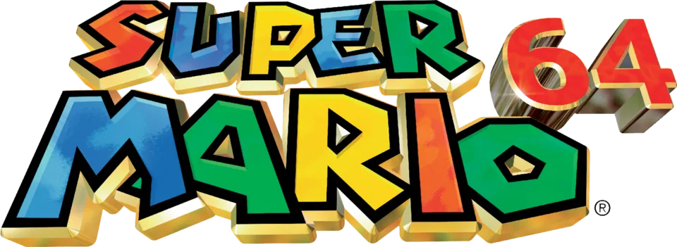
Nintendo draws its own lettering for Mario and sells none of it. The uneven, bouncy SUPER MARIO capitals date from Super Mario Bros. 3 in 1988 and were replaced in 2011 by a rounder in-house typeface that now sets logos and menus across the series; fans have rebuilt both as free fonts. Around that core, individual titles borrow retail faces: the first game's North American box is set in a heavy Helvetica, and by our own comparison the 1989 cartoon's title cards match Dom Casual and the 2023 film's THE SUPER and MOVIE lines match Blackplotan, two names that otherwise come only from a fan wiki.
Games
Films
TV shows
Super Mario is a trademark of Nintendo. Simple But How is not affiliated with or endorsed by Nintendo.