
The Super Mario Bros. Movie fonts
Computer-animated film produced by Illumination and Nintendo and distributed by Universal Pictures.
- Film
- 2023
- Super Mario
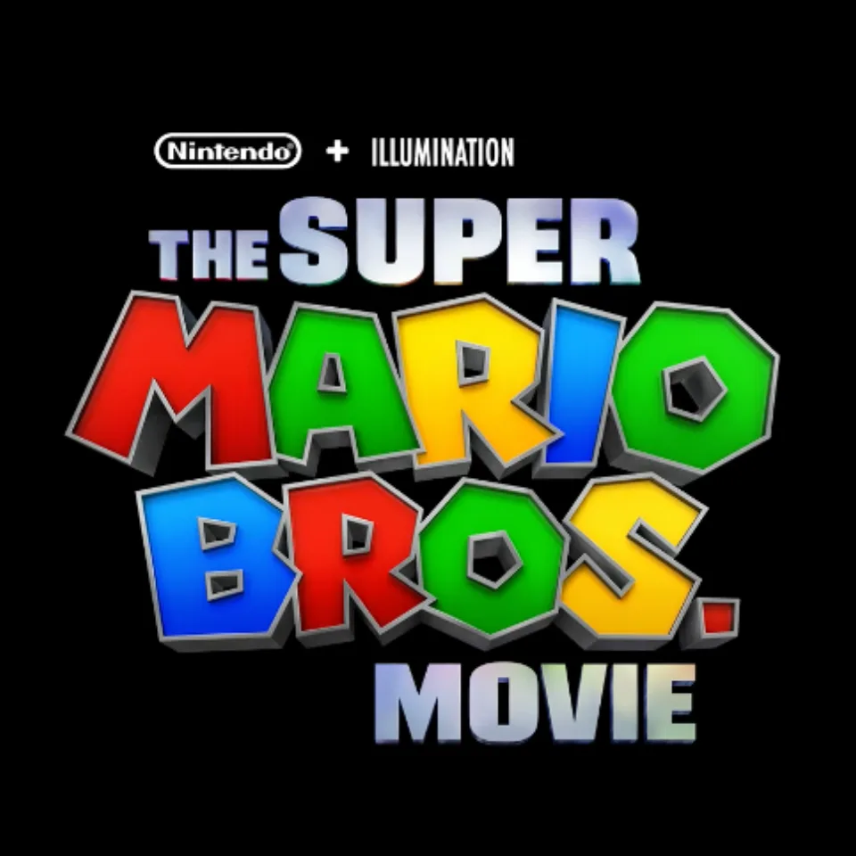
- MARIO BROS. wordmark in the logo: Custom lettering (our visual match)
- THE SUPER and MOVIE lines in the logo: Modified Blackplotan (our visual match)
Try the free alternatives
Type anything to see it in each free font suggested for the lettering you pick. Select a font's name to test it further and download it.
-
The Super Mario Bros. Movie
-
The Super Mario Bros. Movie
-
The Super Mario Bros. Movie
-
The Super Mario Bros. Movie
MARIO BROS. wordmark in the logo
| What it is | Custom lettering drawn for this title, not a font you can install |
|---|---|
| Licence | Proprietary: owned by the rights holder and not offered for licensing. |
Our visual match Our own judgement after comparing the lettering side by side.
No studio statement or identification thread names a font for these letters. The Super Mario Wiki files the logo with the series' modern typeface, but side by side the film's letters are heavier and cut with flat, chamfered corners where the game typeface is rounded, and they keep only its tilt and its square-holed O. By our own judgement they are lettering redrawn for the film on the model of the game logo. The one DaFont thread titled for a Super Mario Bros. movie logo dates from 2019 and shows the 1993 film's logo, not this one.
Sources: List of internal fonts (Super Mario Wiki), Super Mario Bros Movie Logo Font (DaFont forum)
Free alternatives
-
Sarpanch, weight 900 Same mood
At weight 900 its heavy capitals have chamfered outer corners and small rectangular counters, like the faceted blocks of the wordmark. It is level and mechanical, with none of the logo's tilt.
Compared by eye against the original.
-
Tomorrow, weight 900 Same mood
At weight 900 it is nearly solid, with clipped corners and slit-like counters that recall the logo's chunky letters. It is squarer and stiffer than the wordmark.
Compared by eye against the original.
-
Bungee Same mood
Blocky sign-painter capitals with small counters give a similar toy-like weight. Its corners are rounded rather than faceted and the letters sit level.
Compared by eye against the original.
-
Luckiest Guy Same mood
Brings the bounce the block faces lack: heavy comic capitals that lean against each other. Its strokes are wedge-shaped and curved, not faceted.
Compared by eye against the original.
THE SUPER and MOVIE lines in the logo
| What it is | A typeface that was altered for this title |
|---|---|
| Typeface | Blackplotan |
| Designer | Situjuh Nazara |
| Foundry | 7NTypes |
| Licence | Commercial: sold by the foundry, and most uses need a paid licence. |
Our visual match Our own judgement after comparing the lettering side by side.
The only source for the name is the Super Mario Wiki's font list, which gives Blackplotan for this film's logo; neither Illumination nor Nintendo has said so. The label rests on our own comparison with the foundry's specimen: the S with level cuts, the squarish U and P, and the E and R of SUPER agree, as do the M, O and V of MOVIE. In the logo the letters are extruded and given a chrome finish.
Sources: List of licensed fonts A to E (Super Mario Wiki), Blackplotan (7NTypes)
License Blackplotan from 7NTypes
Free alternatives
-
Changa One Similar
A compact, heavy sans whose S ends in level cuts and whose round letters are squared off, as in Blackplotan. It is a little lighter than the logo lines.
Compared by eye against the original.
-
Kanit, weight 900 Similar
At weight 900 it has the same level-ended S and squarish bowls on P and R. Its curves are rounder and its weight slightly lower.
Compared by eye against the original.
-
Passion One, weight 900 Similar
At weight 900 it is as dense as the logo lines, with level cuts on the S and very small counters. It is tighter and more condensed, so words look compressed.
Compared by eye against the original.
-
Archivo Black Same mood
A heavy grotesque with the same blunt poster tone. Its letters are wider and rounder, without Blackplotan's squared curves.
Compared by eye against the original.
What the labels mean
- Our visual match: Our own judgement after comparing the lettering side by side.
- Similar: The same style, with differences you can see.
- Same mood: Gives the same feel without being a look-alike.
What we link to
We link only to owners (the rights holder, the foundry or its official reseller) and to designers' own pages, and we host a fan-made font only with its designer's permission. Every free alternative is published under an open licence and downloads from its page on this site.
More from Super Mario
- Super Mario Odyssey (2017, game) SUPER MARIO and ODYSSEY lettering in the logo: Super Mario typeface (Nintendo in-house)
- Super Mario 64 (1996, game) SUPER MARIO wordmark in the logo: Custom lettering
- The Super Mario Bros. Super Show! (1989, TV show) Series logo: Not identified
- Super Mario Bros. (1985, game) Title on the North American box: Modified Helvetica Black
The Super Mario Bros. Movie and Super Mario are trademarks of Nintendo. Simple But How is not affiliated with or endorsed by Nintendo.