
Super Mario 64 font
Nintendo 64 launch game developed by Nintendo EAD and published by Nintendo.
- Game
- 1996
- Super Mario
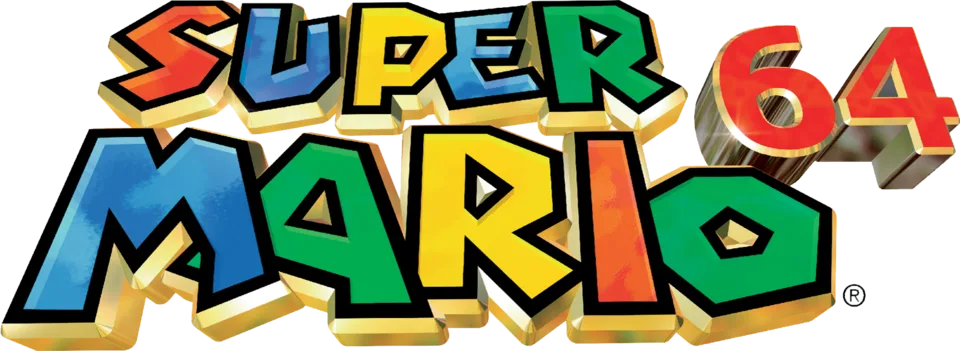
- SUPER MARIO wordmark in the logo: Custom lettering (our visual match)
Try the free alternatives
Type anything to see it in each free font. Select a font's name to test it further and download it.
-
Super Mario 64
-
Super Mario 64
-
Super Mario 64
-
Super Mario 64
SUPER MARIO wordmark in the logo
| What it is | Custom lettering drawn for this title, not a font you can install |
|---|---|
| Licence | Proprietary: owned by the rights holder and not offered for licensing. |
Our visual match Our own judgement after comparing the lettering side by side.
Nintendo has published nothing about this lettering. The only description is in the Super Mario Wiki's list of the series' own fonts, which calls these letters an uneven sans drawn by Nintendo in 1988 for Super Mario Bros. 3 and used for logos until 2012, and shows this logo among its examples. By our own look at the logo on Wikimedia Commons it is drawn lettering: the letters change size and angle from one to the next and are rendered as coloured 3D blocks. For the red 64 beside the wordmark the one DaFont thread offers only Verdana and a fan font, and nothing is settled.
Sources: List of internal fonts (Super Mario Wiki), Font for the "64" part in the Super Mario 64 logo (DaFont forum)
Free alternatives
-
Luckiest Guy Similar
Heavy comic capitals with wedge-shaped strokes and letters that lean slightly against each other, as in the wordmark. Its outlines are smoother and more regular, and its O is a plain oval where the logo's has an angular, tilted counter.
Compared by eye against the original.
-
Lilita One Similar
Thick, tightly spaced capitals with gently flared stroke ends give a similar friendly weight. The letters sit level and evenly sized, without the wordmark's changing angles.
Compared by eye against the original.
-
Skranji Same mood
Chunky letters with irregular, hand-cut angles echo the uneven shapes of the wordmark. It is lighter, its S is drawn with pointed spurs, and the overall look is rougher.
Compared by eye against the original.
-
Titan One Same mood
Very heavy and rounded, for the same bold cartoon feel. Its shapes are soft and even, with none of the logo's sharp corners or tilt.
Compared by eye against the original.
What the labels mean
- Our visual match: Our own judgement after comparing the lettering side by side.
- Similar: The same style, with differences you can see.
- Same mood: Gives the same feel without being a look-alike.
What we link to
We link only to owners (the rights holder, the foundry or its official reseller) and to designers' own pages, and we host a fan-made font only with its designer's permission. Every free alternative is published under an open licence and downloads from its page on this site.
More from Super Mario
- The Super Mario Bros. Movie (2023, film) MARIO BROS. wordmark in the logo: Custom lettering
- Super Mario Odyssey (2017, game) SUPER MARIO and ODYSSEY lettering in the logo: Super Mario typeface (Nintendo in-house)
- The Super Mario Bros. Super Show! (1989, TV show) Series logo: Not identified
- Super Mario Bros. (1985, game) Title on the North American box: Modified Helvetica Black
Super Mario 64 and Super Mario are trademarks of Nintendo. Simple But How is not affiliated with or endorsed by Nintendo.