
The Lord of the Rings fonts
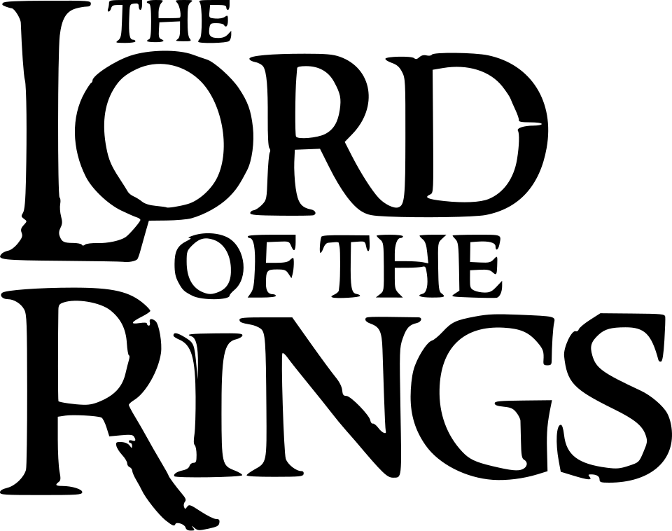
The Lord of the Rings has no single typeface. Book jackets changed with each publisher and decade, from Hawthorn on 1970s Allen & Unwin hardbacks to Stempel Garamond on HarperCollins's 1992 illustrated edition. For Peter Jackson's films the only account is a guide by the fan who drew the best-known replica font: it says the title was hand-drawn and the part titles on posters are Albertus, which our own comparison supports. The studio has published nothing. The Rings of Power has its own custom logo, and its title-sequence credits were lettered by Daniel Reeve, the calligrapher of the films.
Games
Films
TV shows
Books
The Lord of the Rings is a trademark of Middle-earth Enterprises. Simple But How is not affiliated with or endorsed by Middle-earth Enterprises.