
The Lord of the Rings: The Rings of Power fonts
Amazon Prime Video series set in the Second Age, first shown in September 2022.
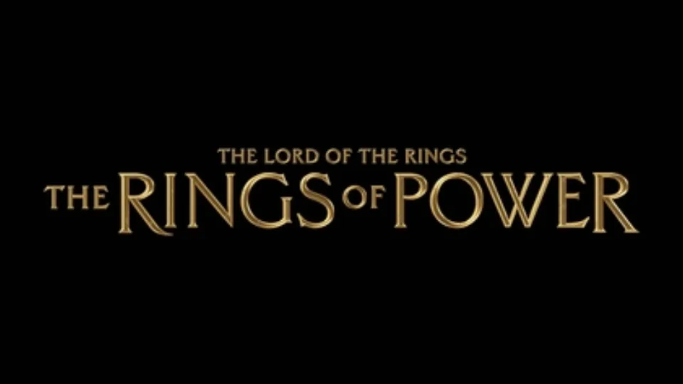
- THE RINGS OF POWER logo: Custom lettering (community identification)
- Title sequence credits: Custom lettering (confirmed)
Try the free alternatives
Type anything to see it in each free font suggested for the lettering you pick. Select a font's name to test it further and download it.
-
The Lord of the Rings: The Rings of Power
-
The Lord of the Rings: The Rings of Power
-
The Lord of the Rings: The Rings of Power
-
The Lord of the Rings: The Rings of Power
THE RINGS OF POWER logo
| What it is | Custom lettering drawn for this title, not a font you can install |
|---|---|
| Licence | Proprietary: owned by the rights holder and not offered for licensing. |
Community identification Agreed by people who identify fonts, with no official word.
Amazon's announcement says the title treatment was cast from molten metal poured into hand-carved wooden moulds, and names neither a typeface nor a lettering artist. DaFont forum threads treat the logo as custom: ITC Carlton is offered as very similar and rejected, and the only matches suggested are fan recreations sold online.
Sources: Amazon Prime Video's Most Anticipated New Series Of 2022 Reveals Its Title (press release on Scoop), The Lord of The Rings - The Rings Of Power font (DaFont forum)
Free alternatives
-
Cinzel, weight 600 Similar
At weight 600 it has the Roman capitals, pointed serifs and wide O of the logo. The logo's strokes flare more and its R and G are taller than their neighbours.
Compared by eye against the original.
-
Marcellus SC Similar
Capitals with flared stems and classical proportions, like the logo's. It is lighter and has no enlarged initials.
Compared by eye against the original.
-
Cormorant SC, weight 700 Similar
At weight 700 it gives sharp, high-contrast capitals of similar width. Its serifs are finer and more bookish than the logo's cast-metal shapes.
Compared by eye against the original.
-
Forum Same mood
Light Roman capitals that give the same antique feel. It is much thinner than the logo.
Compared by eye against the original.
Title sequence credits
| What it is | Custom lettering drawn for this title, not a font you can install |
|---|---|
| Licence | Proprietary: owned by the rights holder and not offered for licensing. |
Confirmed Stated by the rights holder, the designer, the foundry or official brand material.
Plains of Yonder, the studio that made the title sequence, wrote in Motionographer that calligrapher Daniel Reeve hand-drew an original typeface for it, which the studio's creative director set and animated; Art of the Title's credit list names Reeve as calligrapher. It has not been released, and a DaFont thread on the credits ends with commercial fan recreations, not a match.
Sources: Technical Breakdown: Rings of Power and Building a World from Sound (Motionographer), The Lord of the Rings: The Rings of Power (Art of the Title), Rings of Power Credits (DaFont forum)
Free alternatives
-
Alegreya Sans SC, weight 500 Similar
At weight 500 it has the medium weight and flared, pen-made stroke ends of the credit lettering. Its letters are narrower and its A has a normal bar.
Compared by eye against the original.
-
Marcellus SC Similar
Flared capitals with wide C and M, close in structure to the credits. It is lighter and more regular.
Compared by eye against the original.
-
Faculty Glyphic Similar
A sans with slightly flared strokes and classical proportions. It is plainer, without the calligraphic angles of the credit lettering.
Compared by eye against the original.
-
Della Respira Same mood
A flared face with a sharply angled K and M that echoes the hand-drawn feel. Its W and A have decorative crossing strokes that the credits lack.
Compared by eye against the original.
What the labels mean
- Confirmed: Stated by the rights holder, the designer, the foundry or official brand material.
- Community identification: Agreed by people who identify fonts, with no official word.
- Similar: The same style, with differences you can see.
- Same mood: Gives the same feel without being a look-alike.
What we link to
We link only to owners (the rights holder, the foundry or its official reseller) and to designers' own pages, and we host a fan-made font only with its designer's permission. Every free alternative is published under an open licence and downloads from its page on this site.
More from The Lord of the Rings
- Middle-earth: Shadow of Mordor (2014, game) SHADOW OF MORDOR logo: Not identified
- The Lord of the Rings: The Return of the King (2003, film) THE LORD OF THE RINGS logo: Custom lettering
- The Lord of the Rings: The Fellowship of the Ring (2001, film) THE LORD OF THE RINGS logo: Custom lettering
- The Lord of the Rings (1954, book) Jacket title on 1970s Allen & Unwin hardbacks: Hawthorn
The Lord of the Rings: The Rings of Power and The Lord of the Rings are trademarks of Middle-earth Enterprises. Simple But How is not affiliated with or endorsed by Middle-earth Enterprises.