
The Lord of the Rings: The Fellowship of the Ring fonts
First film of Peter Jackson's trilogy, produced by New Line Cinema.
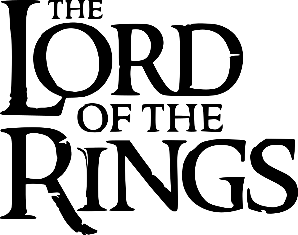
- THE LORD OF THE RINGS logo: Custom lettering (community identification)
- THE FELLOWSHIP OF THE RING line on posters: Albertus (our visual match)
Try the free alternatives
Type anything to see it in each free font suggested for the lettering you pick. Select a font's name to test it further and download it.
-
The Lord of the Rings: The Fellowship of the Ring
-
The Lord of the Rings: The Fellowship of the Ring
-
The Lord of the Rings: The Fellowship of the Ring
-
The Lord of the Rings: The Fellowship of the Ring
THE LORD OF THE RINGS logo
| What it is | Custom lettering drawn for this title, not a font you can install |
|---|---|
| Licence | Proprietary: owned by the rights holder and not offered for licensing. |
Community identification Agreed by people who identify fonts, with no official word.
A guide on TheOneRing.net by Peter Klassen, who drew the fan fonts Ringbearer and Aniron, says the on-screen title was hand-drawn by Alan Lee and that the version on posters and merchandise is set in Sauron, a font made for the films by The Ant Farm and supplied only to licensees. No studio source confirms either point. DaFont forum requests about the logo are answered with Ringbearer, which Klassen says he built by studying the logo's versions in many languages.
Sources: The Lord of the Fonts, a guide by Peter Klassen (TheOneRing.net), lord of the rings font ?? (DaFont forum)
Fan-made replicas
Fonts made by fans to recreate this lettering. They are not official, and each author sets their own terms.
- Ringbearer by Pete Klassen. Personal use only.
Sources: Ringbearer by Pete Klassen (DaFont), The Lord of the Fonts, a guide by Peter Klassen (TheOneRing.net)
"Personal use only" rules out commercial work: anything you sell, client projects, merchandise and monetised videos. Treat a replica with no stated licence the same way.
Free alternatives
-
Cinzel, weight 700 Similar
At weight 700 it has the bold Roman capitals and sharp serifs of the logo. Its edges are clean, and it lacks the logo's oversized L and R and its worn, chiselled outline.
Compared by eye against the original.
-
IM Fell English SC Similar
Old-style small capitals with rough, uneven edges that come close to the logo's weathered look, with larger capitals for the initials. The letters are wider and the serifs softer.
Compared by eye against the original.
-
Caudex, weight 700 Similar
At weight 700 it gives sturdy capitals with wedge serifs and a medieval-manuscript flavour. It is lighter and more regular than the logo.
Compared by eye against the original.
-
Cinzel Decorative, weight 700 Same mood
At weight 700 its swashed capitals give a fantasy title feel. The curling swashes are not in the logo, which is plain and carved-looking.
Compared by eye against the original.
THE FELLOWSHIP OF THE RING line on posters
| What it is | A retail typeface |
|---|---|
| Typeface | Albertus |
| Designer | Berthold Wolpe |
| Foundry | Monotype |
| Licence | Commercial: sold by the foundry, and most uses need a paid licence. |
Our visual match Our own judgement after comparing the lettering side by side.
The only source is Peter Klassen's fan guide on TheOneRing.net, which names Albertus, Berthold Wolpe's flared display face, for the part titles on the posters and says the part titles seen on screen are separate hand lettering by Daniel Reeve. Our own comparison supports it: in the Italian-language version of the poster logo on Wikimedia Commons the part title is set in widely spaced capitals of medium weight with flared, serifless strokes, a splayed M and a wide round C, G and O, which agrees with an Albertus specimen. New Line has not confirmed it.
Sources: The Lord of the Fonts, a guide by Peter Klassen (TheOneRing.net)
License Albertus from Monotype
Free alternatives
-
Alegreya Sans SC, weight 500 Similar
At weight 500 it is a sans whose strokes flare at the ends, as Albertus's do, at about the weight of the poster line. It is narrower and its curves are more calligraphic.
Compared by eye against the original.
-
Marcellus Similar
Capitals with flared stems and wide, round O and C, the same idea as Albertus. It comes in one weight, a little lighter than the poster line.
Compared by eye against the original.
-
Faculty Glyphic Similar
A sans with gently flared stroke ends and classical proportions. It has only a regular weight and its letters are narrower than Albertus's.
Compared by eye against the original.
What the labels mean
- Community identification: Agreed by people who identify fonts, with no official word.
- Our visual match: Our own judgement after comparing the lettering side by side.
- Similar: The same style, with differences you can see.
- Same mood: Gives the same feel without being a look-alike.
What we link to
We link only to owners (the rights holder, the foundry or its official reseller) and to designers' own pages, and we host a fan-made font only with its designer's permission. Every free alternative is published under an open licence and downloads from its page on this site.
More from The Lord of the Rings
- The Lord of the Rings: The Rings of Power (2022, TV show) THE RINGS OF POWER logo: Custom lettering
- Middle-earth: Shadow of Mordor (2014, game) SHADOW OF MORDOR logo: Not identified
- The Lord of the Rings: The Return of the King (2003, film) THE LORD OF THE RINGS logo: Custom lettering
- The Lord of the Rings (1954, book) Jacket title on 1970s Allen & Unwin hardbacks: Hawthorn
The Lord of the Rings: The Fellowship of the Ring and The Lord of the Rings are trademarks of Middle-earth Enterprises. Simple But How is not affiliated with or endorsed by Middle-earth Enterprises.