
Avatar: Fire and Ash fonts
Third Avatar film, directed by James Cameron and released by 20th Century Studios.
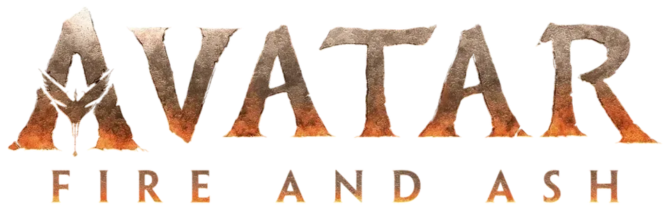
- AVATAR wordmark in the logo: Toruk (our visual match)
- FIRE AND ASH line in the logo: Not identified
Try the free alternatives
Type anything to see it in each free font suggested for the lettering you pick. Select a font's name to test it further and download it.
-
Avatar: Fire and Ash
-
Avatar: Fire and Ash
-
Avatar: Fire and Ash
-
Avatar: Fire and Ash
AVATAR wordmark in the logo
| What it is | A typeface owned by the rights holder and not sold |
|---|---|
| Typeface | Toruk |
| Designer | Zach Fannin and John Roshell |
| Licence | Proprietary: owned by the rights holder and not offered for licensing. |
Our visual match Our own judgement after comparing the lettering side by side.
No source discusses this logo's lettering. By our comparison of the logos on Wikimedia Commons, the wordmark is the same chiselled Toruk AVATAR used for The Way of Water, including the A shaped like a flying banshee, now coloured like scorched stone; the Toruk identification rests on the producers' statements about the sequels' typeface.
Sources: The Avatar team saw that SNL sketch and designed a new font for the sequels (Syfy Wire), The Intertwining History of the Avatar Papyrus Font and the SNL Sketch That Spoofed It (The Ringer)
Free alternatives
-
Cinzel, weight 900 Similar
At weight 900 it has the same heavy inscriptional capitals with wedge-shaped serifs and a pointed A. It is cleaner and higher in contrast than Toruk's rough, rock-cut strokes.
Compared by eye against the original.
-
Grenze, weight 900 Similar
At weight 900 its chunky capitals end in faceted, chisel-like serifs that come close to Toruk's carved look. It is more compact, and its A and R are squarer.
Compared by eye against the original.
-
Trirong, weight 900 Similar
At weight 900 it gives the same dark, wide serif capitals with flaring feet. Its outlines are smooth and its serifs are bracketed rather than chipped.
Compared by eye against the original.
-
Rakkas Same mood
A very heavy display serif with tapered, slightly irregular strokes that gives a similar monumental weight. It is more condensed and its high contrast reads as poster lettering rather than stone.
Compared by eye against the original.
FIRE AND ASH line in the logo
This font has not been identified. No source names the face of the spaced line under the wordmark. It looks like the line on The Way of Water logo, which is also unidentified; it may be a lighter weight of Toruk, but nobody says so. We checked Fonts In Use and searched the DaFont forum.
Free alternatives
-
Marcellus SC Similar
Flared, medium-weight capitals that end in small swellings rather than full serifs, as in the logo's line. Its contrast is a little higher and its serifs a little more pronounced.
Compared by eye against the original.
-
Forum Similar
Light Roman capitals with tapered strokes that hold up when tracked wide like the logo line. It is lighter and narrower than the line.
Compared by eye against the original.
-
Cinzel Same mood
Inscriptional capitals with fine serifs that give the same classical, spaced-out caption feel. The serifs are sharper and more visible than in the logo.
Compared by eye against the original.
What the labels mean
- Our visual match: Our own judgement after comparing the lettering side by side.
- Similar: The same style, with differences you can see.
- Same mood: Gives the same feel without being a look-alike.
What we link to
We link only to owners (the rights holder, the foundry or its official reseller) and to designers' own pages, and we host a fan-made font only with its designer's permission. Every free alternative is published under an open licence and downloads from its page on this site.
More from Avatar
Avatar: Fire and Ash and Avatar are trademarks of 20th Century Studios and Lightstorm Entertainment. Simple But How is not affiliated with or endorsed by 20th Century Studios and Lightstorm Entertainment.