
Avatar: The Way of Water fonts
First Avatar sequel, directed by James Cameron and released by 20th Century Studios.
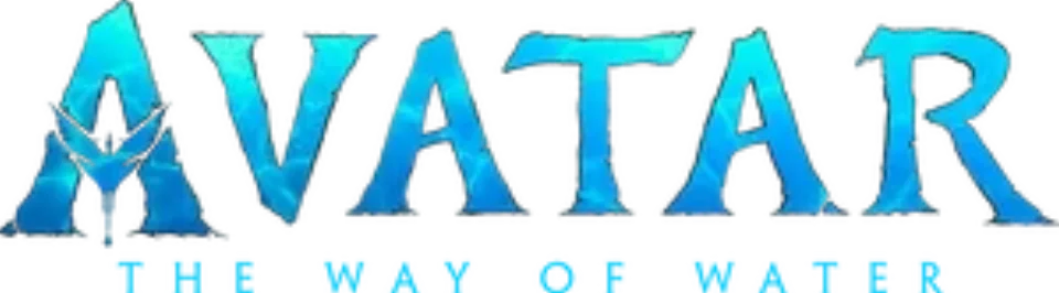
- AVATAR wordmark in the logo: Toruk (confirmed)
- THE WAY OF WATER line in the logo: Not identified
- Subtitles for non-human speech: Papyrus (community identification)
Try the free alternatives
Type anything to see it in each free font suggested for the lettering you pick. Select a font's name to test it further and download it.
-
Avatar: The Way of Water
-
Avatar: The Way of Water
-
Avatar: The Way of Water
-
Avatar: The Way of Water
AVATAR wordmark in the logo
| What it is | A typeface owned by the rights holder and not sold |
|---|---|
| Typeface | Toruk |
| Designer | Zach Fannin and John Roshell |
| Licence | Proprietary: owned by the rights holder and not offered for licensing. |
Confirmed Stated by the rights holder, the designer, the foundry or official brand material.
Producer Jon Landau named the sequels' own typeface Toruk and said it replaced Papyrus, as Syfy Wire reports from his interview. The Ringer explains how it was made: graphic designer Zach Fannin began drawing the letters in 2017 from a chiselled-rock A logo, and in 2019 John Roshell redrew the outlines, set the spacing and built several weights. It is not sold, so there is no foundry page.
Sources: The Avatar team saw that SNL sketch and designed a new font for the sequels (Syfy Wire), The Intertwining History of the Avatar Papyrus Font and the SNL Sketch That Spoofed It (The Ringer)
Free alternatives
-
Cinzel, weight 900 Similar
At weight 900 it has the same heavy inscriptional capitals with wedge-shaped serifs and a pointed A. It is cleaner and higher in contrast than Toruk's rough, rock-cut strokes.
Compared by eye against the original.
-
Grenze, weight 900 Similar
At weight 900 its chunky capitals end in faceted, chisel-like serifs that come close to Toruk's carved look. It is more compact, and its A and R are squarer.
Compared by eye against the original.
-
Trirong, weight 900 Similar
At weight 900 it gives the same dark, wide serif capitals with flaring feet. Its outlines are smooth and its serifs are bracketed rather than chipped.
Compared by eye against the original.
-
Rakkas Same mood
A very heavy display serif with tapered, slightly irregular strokes that gives a similar monumental weight. It is more condensed and its high contrast reads as poster lettering rather than stone.
Compared by eye against the original.
THE WAY OF WATER line in the logo
This font has not been identified. No source names the face of the widely spaced line under the wordmark. The Ringer says Roshell built Toruk in several weights, so this may be a lighter Toruk, but nobody states it. We checked Fonts In Use and searched the DaFont forum; neither has an identification.
Free alternatives
-
Marcellus SC Similar
Flared, medium-weight capitals that end in small swellings rather than full serifs, as in the logo's line. Its contrast is a little higher and its serifs a little more pronounced.
Compared by eye against the original.
-
Forum Similar
Light Roman capitals with tapered strokes that hold up when tracked wide like the logo line. It is lighter and narrower than the line.
Compared by eye against the original.
-
Cinzel Same mood
Inscriptional capitals with fine serifs that give the same classical, spaced-out caption feel. The serifs are sharper and more visible than in the logo.
Compared by eye against the original.
Subtitles for non-human speech
| What it is | A retail typeface |
|---|---|
| Typeface | Papyrus |
| Designer | Chris Costello |
| Foundry | Letraset (now sold by ITC) |
| Licence | Commercial: sold by the foundry, and most uses need a paid licence. |
Community identification Agreed by people who identify fonts, with no official word.
ComicBook.com reports from the film that Papyrus is gone from the title card and credits but returns for subtitled speech, such as the translated calls of the tulkun Payakan; Wikipedia's article on the typeface repeats this. No statement from the studio was found.
Sources: Does Avatar: The Way of Water Include the Papyrus Font? (ComicBook.com), Papyrus (typeface) (Wikipedia)
License Papyrus from Letraset (now sold by ITC)
Free alternatives
-
Macondo Similar
A calligraphic sans with flared, slightly uneven strokes and a hooked J, close to Papyrus's hand-lettered skeleton. It is heavier and smoother, with a larger x-height.
Compared by eye against the original.
-
Almendra Similar
Pen-shaped lowercase with tall ascenders and angled stroke ends, as in Papyrus. It is darker and has small wedge serifs where Papyrus has rough, open ends.
Compared by eye against the original.
-
Metamorphous Similar
Shares Papyrus's flared capitals and its long, kicked legs on K and R. The lowercase is wider and the edges are clean rather than roughened.
Compared by eye against the original.
What the labels mean
- Confirmed: Stated by the rights holder, the designer, the foundry or official brand material.
- Community identification: Agreed by people who identify fonts, with no official word.
- Similar: The same style, with differences you can see.
- Same mood: Gives the same feel without being a look-alike.
What we link to
We link only to owners (the rights holder, the foundry or its official reseller) and to designers' own pages, and we host a fan-made font only with its designer's permission. Every free alternative is published under an open licence and downloads from its page on this site.
More from Avatar
Avatar: The Way of Water and Avatar are trademarks of 20th Century Studios and Lightstorm Entertainment. Simple But How is not affiliated with or endorsed by 20th Century Studios and Lightstorm Entertainment.